DEX-389 Global alerts: Remove unintended left-side border/stroke
Jira Link
This bug relates to the Global Alerts component variant.
The component currently displays an unintended thick vertical border on the left-hand side, which is not part of the approved design specifications. As the Global Alerts component spans the full viewport width, the additional border is unnecessary and creates a visual inconsistency with the intended design.
As part of this release, the unintended left-side border has been removed to align the component with the approved design and ensure a consistent user experience.
Please find the attached screenshot below showing the updated design after the fix.
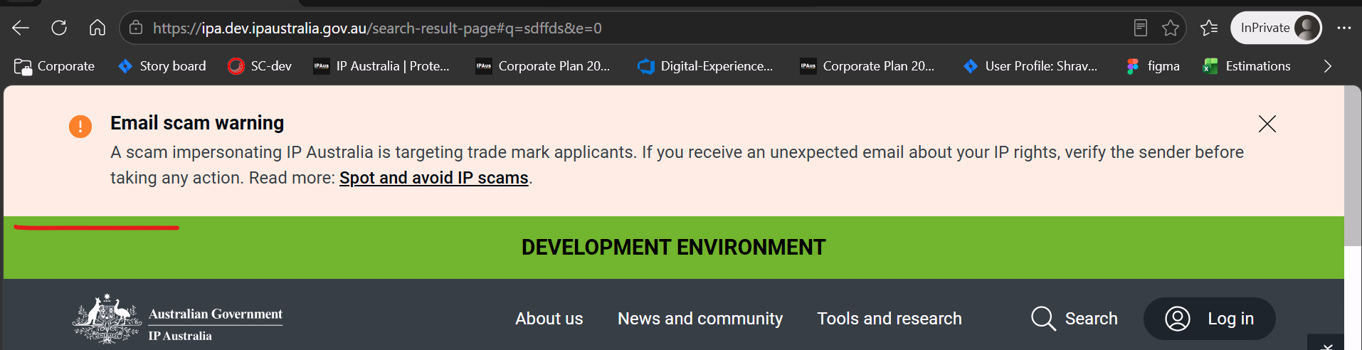
DEX 389 - Fix
DEX-161 Remove custom styling from content/components
Jira Link
Many components currently have custom styling applied through inline CSS or component-level styling overrides. These custom styles can override the standardised design system and lead to inconsistent presentation across the website.
Authors should avoid applying custom styling unless there is a specific business requirement that has been approved. Components should rely on the out-of-the-box design and styling to ensure consistency, accessibility, and maintainability.
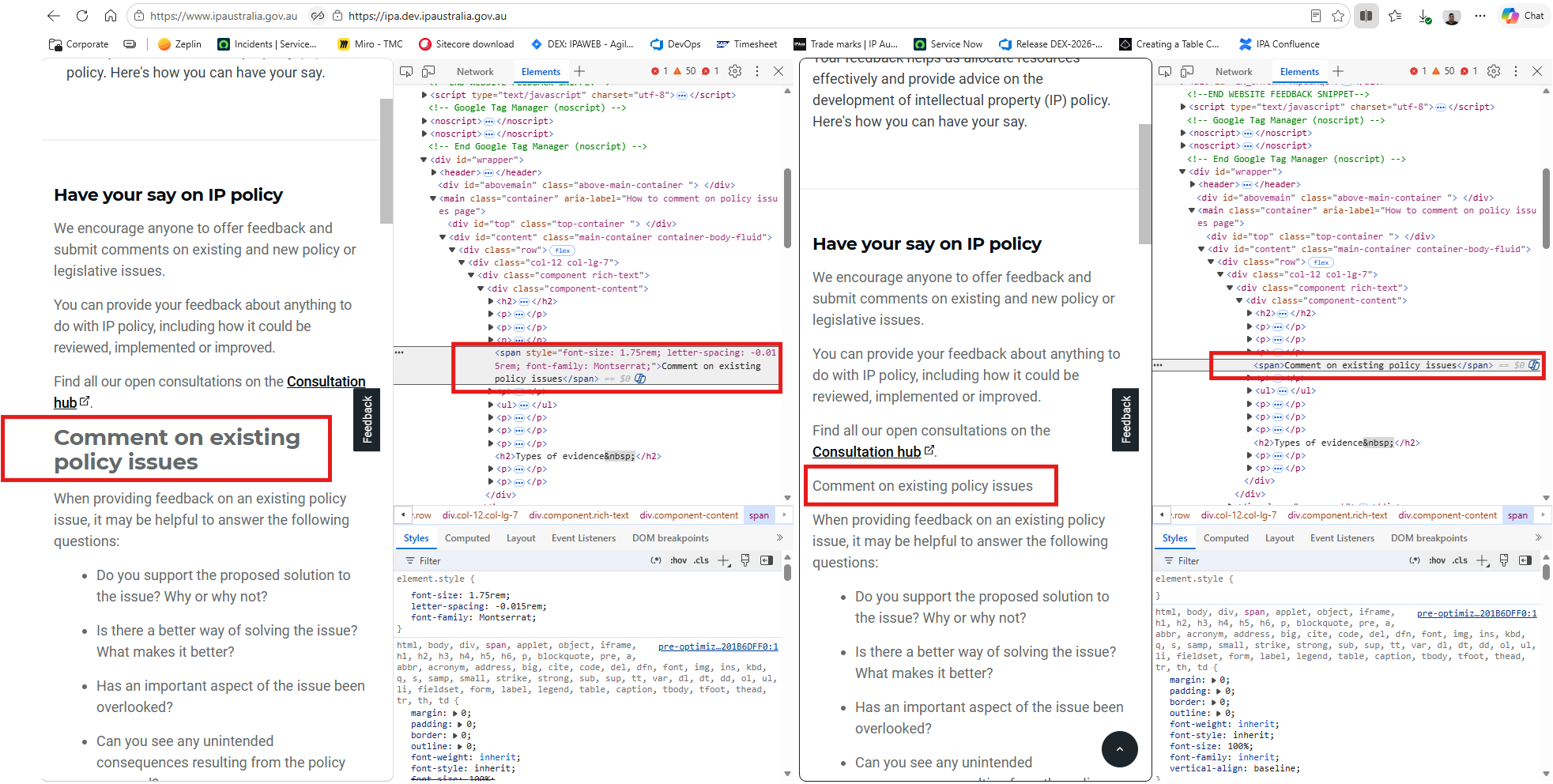
DEX-417 Incorrect UI of the interactive state of the primary button (search)
Jira Link
This bug relates to the interactive state of the Primary Search Button.
The current implementation does not align with the approved design specifications, resulting in an inconsistent user experience when users interact with the button. The visual styling applied during the hover, focus, and active states differs from the expected design.
As part of this release, the interactive states of the Primary Search Button have been updated to align with the approved UI design and ensure a consistent user experience across the website.
Please find the attached screenshot below showing the updated interactive state following the fix.
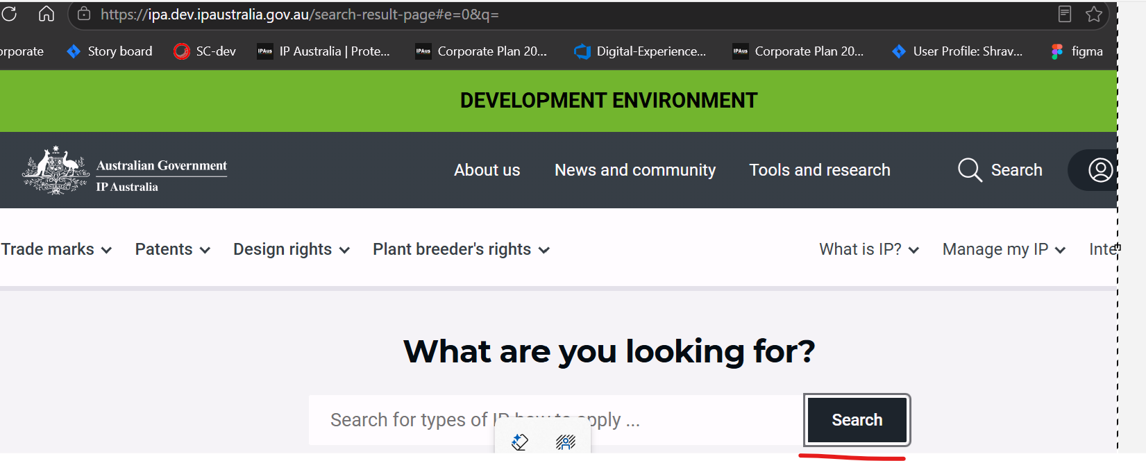
DEX 417 - Fix
DEX-478 Excessive padding in title area on mobile
Jira Link
This bug relates to excessive padding within the Title Area component on mobile devices.
The current implementation applies additional spacing beyond the approved design specifications, resulting in inefficient use of screen space and an inconsistent mobile experience.
As part of this release, the spacing within the Title Area component has been adjusted to align with the approved design specifications and improve content presentation on smaller screens.
Please find the attached screenshot below showing the updated mobile spacing after the fix.
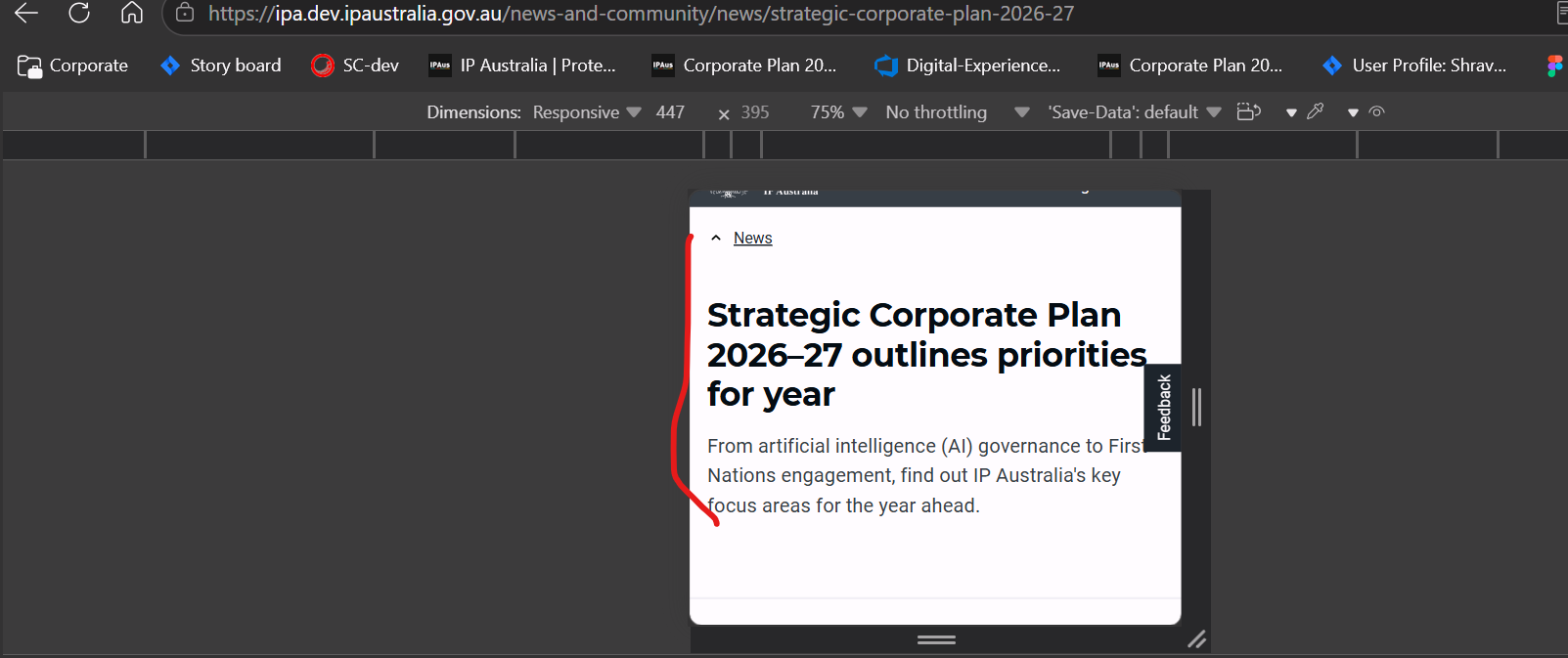
DEX 478 - Fix
DEX-500 Text alignment with image component
Jira Link
This bug relates to the alignment of text within the Image component.
The current implementation does not align text content correctly relative to the associated image, resulting in an inconsistent visual presentation and reduced readability.
As part of this release, the text alignment within the Image component has been adjusted to align with the approved design specifications and provide a more consistent user experience.
Please find the attached screenshot below showing the updated text alignment after the fix.
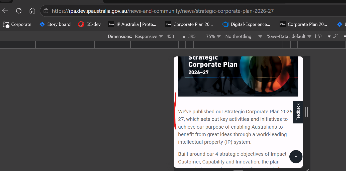
DEX-500 - Fix
DEX-526 [PROD][UAT] single accordion with heading has spacing issue
Jira Link
This bug relates to a spacing issue when a Single Accordion with a Heading is displayed.
The current implementation introduces additional spacing around the accordion component when only a single accordion item is configured with a heading. This results in inconsistent spacing compared to the approved design specifications and other accordion configurations.
As part of this release, the spacing has been adjusted to ensure consistent presentation regardless of the number of accordion items displayed.
Please find the attached screenshot below showing the updated spacing after the fix.
DEX-527 [PROD][UAT] Extra top space coming when first component is accordion
Jira Link
This bug relates to excessive top spacing when an Accordion component is the first component displayed on a page.
The current implementation introduces additional top spacing above the Accordion component when it appears as the first component on the page, resulting in inconsistent spacing and misalignment with the approved design specifications.
As part of this release, the spacing has been adjusted to ensure consistent vertical alignment and presentation when the Accordion component is positioned at the top of the page.
Please find the attached screenshot below showing the updated spacing after the fix.
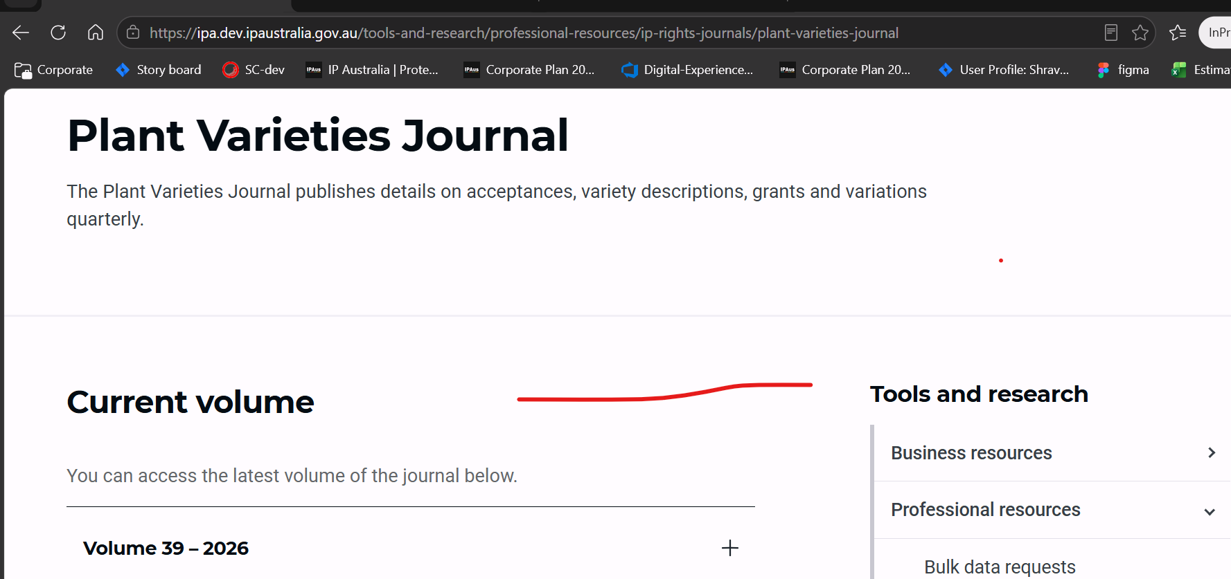
DEX-527 - Fix
DEX-528 Excessive padding around Title Area and Search IP Banner on homepage
Jira Link
This bug relates to excessive padding around the Title Area and Search IP Banner components on the homepage.
The current implementation applies additional spacing between these components, resulting in excessive whitespace and reducing the effective use of screen space. This causes the homepage layout to differ from the approved design specifications.
As part of this release, the spacing between the Title Area and Search IP Banner components has been adjusted to align with the approved design and provide a more balanced and consistent user experience.
Please find the attached screenshot below showing the updated spacing after the fix.
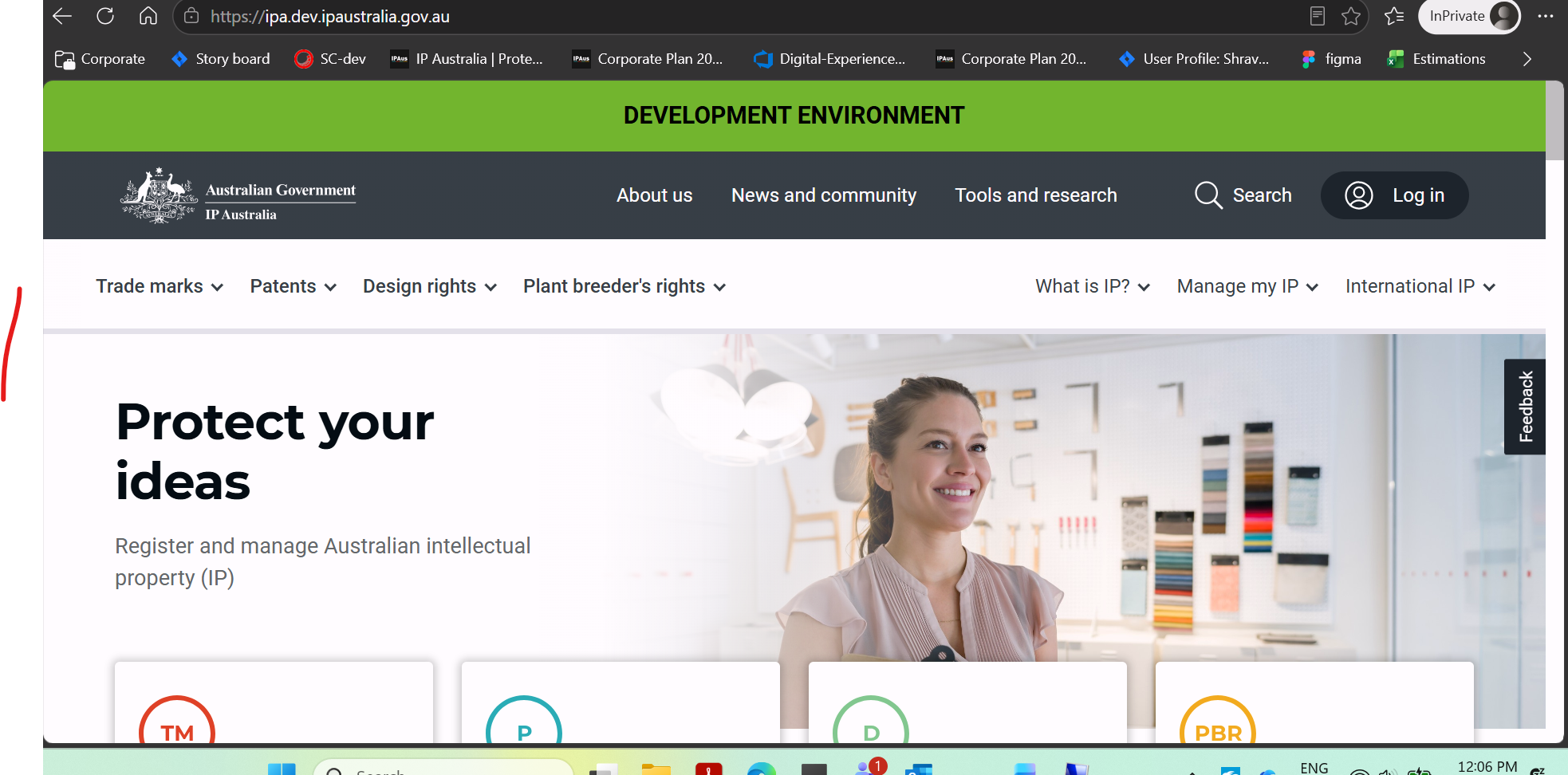
DEX-528 - Fix
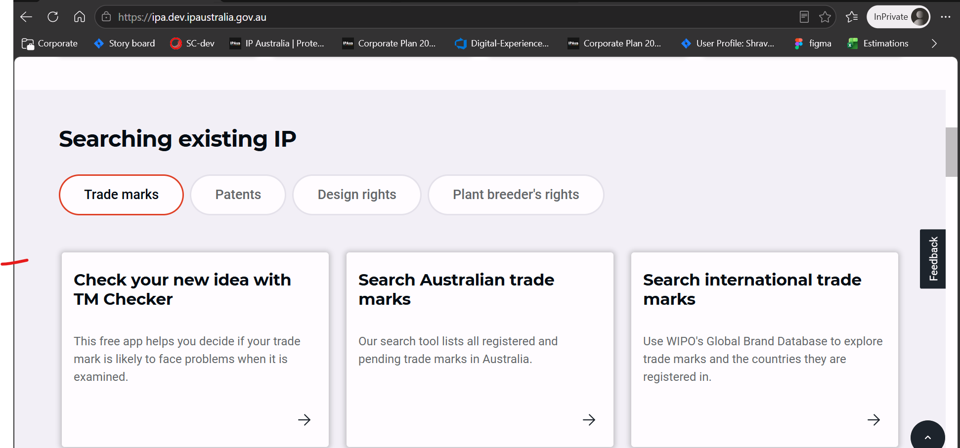
DEX-528 - Fix